So soon after i started to check up online sites, where you could use there designs or create your own and place all the information you needed for possible clients to get in contact with you. The one i found to be the best was a company called Vistaprint.
The only thing about the card that i had created was that i now do not wish to be an animator, i want to be a 3D modeler, so i now have 500 business cards which i have no idea what to do with.
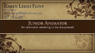
Here is the design of the current business cards i have which i know have no use for, and i now need to start thinking of creating a new one. I could use this template as i think it is very professional and tidy.
The next day i went back onto Vistaprint to start a new search on what i thought could be a possibly good template for a new business card. I used the same template as before but changed it so that i had my skill as a 3D modeler and took away a phrase as i was a little unsure if i needed one.
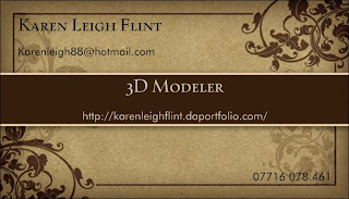
I have changed the layout to this business card as i wanted to try something a little different but once i had made it, i actually preferred the old layout. The good thing about me re-doing a business card is that i now have a website to promote which will greatly help to get a job opportunity. I really like this design but as i had this before i thought it was the best to have a new design, as i feel like a fresh start as i now have a new career goal.
As i was thinking a little deeper into business cards, i thought to myself, i can only really place one main area of arts onto the card, but what if i was applying for a job to be a concept artist, or to be a graphic designer as we all need a back up in case we don't get the dream job we wish for. So being a little opened minded, i thought to myself that it would be great to create some cards for other professions within art which i have skills in.
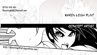
Here is something very different to my previous card. The image makes it very clear that this person wants to be some sort of 2d artist, weather it is to be a storyboard artist or a concept artist. The layout is slightly messy compared to my previous card as i did not want everything to be placed on one side, i quite like this card, but i think i need to think a little harder into the layout.
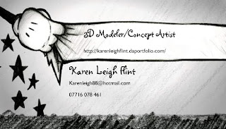
I went for this design as another way of showing my skills in a different area as it is a 2D drawing of what looks like Mickey mouse's hand but from the early 1920s. Disney is one of the most amazing companies through what they have learned and how they have changed as time has gone by, so this card spoke out to me a little. I thought i would put in two titles on my business card to show that i have more than one main skill, but once this was completed, i thought to myself that i can not really do this when applying for jobs. So back to designing i went.
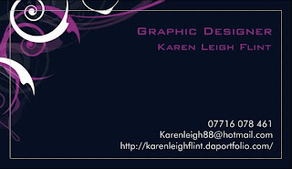
I have now started to think a little more about my graphic design skills. Something simple, clear and to the point is normally the way with graphic design. Something that catches your eyes, even though there is not much detail to make it stand out. I like the layout i have done for this card, i feel like i have a title with the useful information underneath.

Here i have used the same design and layout but have changed the career title to see how it looked on a more graphical business card. My thoughts to this though are not so positive i feel i would be confusing people with mixed messages.
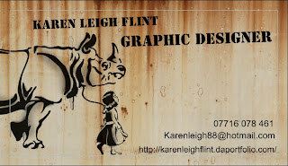
Here is a template which i have fallen in love with, everything about the card i love. The stencil is very much like the artist Banksy, who i think is fascinating. I like the layout as it is a little different to others but is still easy and clear to follow and read. The only bad thing about this is that it does not relate to animation, which is something i have found to be quite a pain. It is hard to show 3D modeling within a business card. My next thoughts now are to go and create one, using one of my 3D models and see how that turns out.
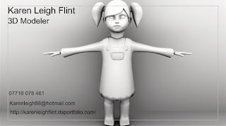
Here is a business card with one of my own 3D models. This was more of a test to have a quick look into how one of my own images would look. This image is not one of the best examples but i am now starting to get a better understanding on what is needed to create a good business card. Once my character have been rigged and textured, i instead to place her in a nice pose which would make my card much more interesting, i also need to thinking a little harder into the font and layout of my business card but once i have gone a little more 3D work, then i shall create my business card.
No comments:
Post a Comment